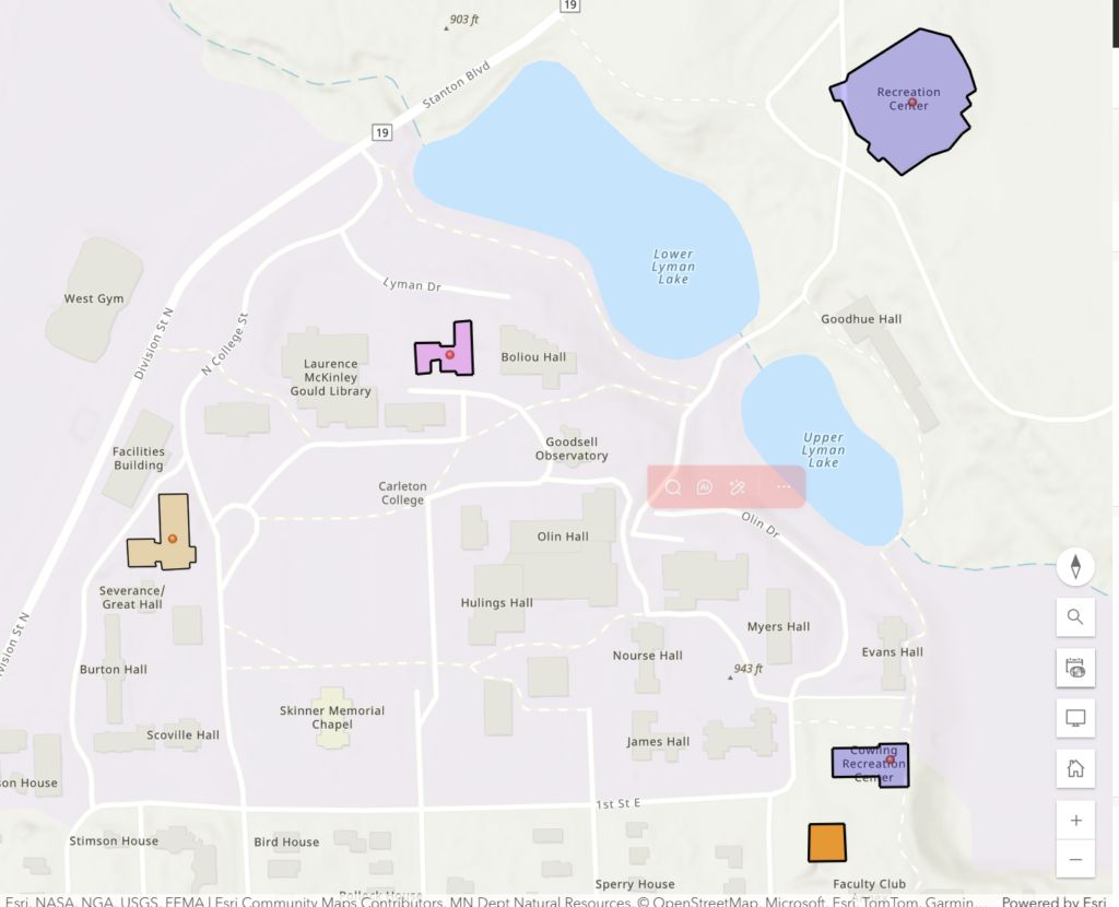
This week’s lab was about turning spatial data into a personal story by creating a web map of places that matter to me on campus. Using ArcGIS Online, I built a map highlighting five locations that shape my daily life at Carleton: Watson Hall, Cowling Gymnasium, the Center for Math and Computing (CMC), the Recreation Center, and Sayles-Hill Campus Center. Each of these spots plays a different role in my routine—from where I live and study to where I unwind with friends and teammates.
I started by creating a .csv file that listed the names, types, and coordinates of my chosen locations. I then uploaded it into ArcGIS Online using the “Add Layer from File” option, which automatically placed each point onto the map. Once the data appeared, I customized the symbology to make each location distinct—changing colors and icons so that dorms, gyms, and academic spaces each had a different visual cue. I also experimented with labels and transparency settings to keep the map clean but informative.
After plotting my points, I created polygon layers to outline the buildings I frequent most, like Watson Hall and the CMC. This step gave the map more depth by showing not just where these places are, but how they occupy space on campus. Adjusting the colors and outlines helped highlight these footprints without overwhelming the basemap.
As shown in my map below, these layers together create a snapshot of my personal geography at Carleton—my movement between classes, practices, and social spaces.
You can explore the interactive version of my map here: ArcGIS Web Map Link.
And here’s my CSV dataset used to plot the locations.
Creating this map made me realize how web mapping connects personal experience to spatial storytelling. It’s not just about plotting points—it’s about visualizing relationships and routines. In the context of the digital humanities, this kind of mapping opens new ways to explore history, identity, and movement through space. It can combine data, narrative, and design into a single interactive story that anyone can explore.
Overall, I found ArcGIS Online surprisingly accessible once I got used to the interface. The ability to add layers, adjust symbology, and even publish a web app made it feel powerful without being overwhelming. I especially liked how easy it was to embed the final product into my WordPress site, making the map part of a larger reflection. This lab showed me that web mapping isn’t just a technical skill—it’s a creative tool for seeing familiar places in a new light.