Initial Start
The process for this assignment was pretty neat. I don’t have much background in data visualization but I figured I could mess around with the tools and see what happens. Initially, I had no clue what the tools on rawgraphs.io did in detail. Once I got a better feel for what I wanted to represent, I thought more clearly about which graph to use.
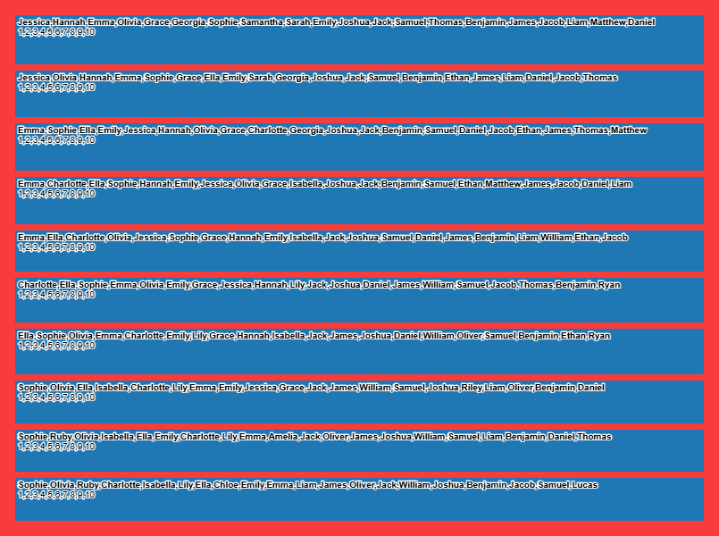
For this first graph, I added every piece of data we had on the baby names. I realized here that it wouldn’t be necessary (or even wise at times) to include everything. Just because we have a piece of information doesn’t mean it needs to be used. I am sure that it could be made to look better, but using these color selections and font size/ordering, this is pretty much about as bad as it can get and a reference point of what not do.
My Actual Graph

I was very pleased with this graph. It uses 3 points of information (but shows 4, I will elaborate in a moment). I used the Alluvial Diagram. The pieces of information I used were the Names, Years, and Count. I added color to denote gender, but it wasn’t explicitly data that was fed into the site. We are disregarding rank. I would rather have clarity in a graph showing how many times a name was in the top 10 names of the year rather than including its exact rank in a given year. That would be pretty complicated regardless because that would account for 200 different points of additional data to be included. Top 10 of both genders for 10 years could make the clarity of the graph confusing.
Limitations

This graph is similar, but the years are sorted on the right. The drawback is the left where name frequency was clear is now lost. Ideally, I could have sorted both sides (one by year order and names by count), but I am limited by the tools available on the site and I couldn’t figure out a way to show both to my liking. In the end, I went with the first one.
Connection to the reading
Websites that require information about gender as part of their account registration process almost always only provide a binary choice: “male or female.”undefined For Munir, those options are insufficient. They also take an emotional toll: “I wince as I’m forced to choose ‘female’ over ‘male’ every single time, because that’s what my passport says, and … being non-binary is still not legally recognised in the UK,” Munir explains.
https://data-feminism.mitpress.mit.edu/pub/h1w0nbqp/release/3
In a changing world, the method in which things are done needs to be adapted. This includes gender representation. As mentioned with signing up for websites, it is the mandatory binary selections that are part of the issue. I created a scenario where this same data is found, but from another angle:
There are some things to consider. For example, let’s say you took a survey of most common names of people in 2040 of those born in the years 2001-2010. The information may not look the same. Maybe some undergo gender changes, become non-binary, or change their names to where their birth names are now considered dead names. The data may not look identical. Further, it won’t come from a sample of people born (where gender can be logged as binary, being the assigned gender at birth), the people will be consenting adults where some people may choose to decline to participate. If such as study is made, these limitations and constraints should be noted for an informed and transparent study.
Hey Kevin,
I really appreciate your insight from your first graph you made. I agree that though we might feel a need to include every single piece of information, it is not necessary. More importantly, you point out that it is a reference point for what not to do. I am coming to realize that a big part of digital humanities is trial and error, testing different things and learning from your mistakes. You showcase this perfectly. Thank you!