For my two data visualization graphs, I made a lollipop graph (although the lines wouldn’t appear for some reason) using Flourish and a corresponding line graph using RAWGraphs.
My lollipop graph displays each name’s average ranking and shows roughly how much data–in terms of years–exists for each name through dot size. The bigger the dot, the greater the number of years the name was recorded (10 years being the max). The dots are also color coded by gender: blue representing “male” names, and red “female” names. Since a lower ranking is considered to be better, we can see from this graph that the male name Jack had the lowest (best) average ranking over 10 years of tracking, while Ruby had the best average rank among female names. However, since the name Ruby only had 2 years worth of data, her average is skewed lower. Sophie has the next lowest rank across 10 years of data. I made sure to depict the year count so that it could be seen that some average rankings were skewed by the lack of that name’s data. Unfortunately, I couldn’t figure out how to add multiple legends in Flourish, which would key people into size differences between the dots as well.
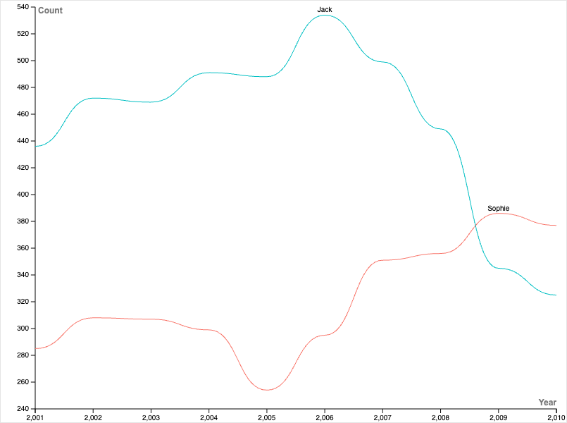
Knowing the high approval and usage of the names Jack and Sophie. I wanted to see how their usage fluctuated over their ten years of data. So, I created a line graph that visualizes the number of babies given the name Jack or Sophie in a corresponding year. From this, we can see trends that could suggest cultural shifts. It appears that the names Jack and Sophie had opposing trends, despite similarly good average rankings throughout the decade. In the early 2000s, the name Jack became more and more popular until 2006, where it then peaked and declined in usage. In contrast, the name Sophie was down trending until 2005, where its usage then increased over the next 5 years.
On both graphs, I used contrasting colors to distinguish between gender categorizations. Practices of color contrast or separating data visuals based on categories are recommendations that I remembered from Lin’s lecture. It’s also important to think about how labeling things using binaries (like M/F) might feel exclusive, especially with outdated data such as this.
I like your utilization of colors! It lets us add some clarity to the graph in a way (in this case) that is really simple to understand. The first graph showing rank looks visually appealing, it is good that you mention the possible skew (and citing an example) as a limitation of using this sort of graph. You mentioned having issues adding a detailed legend. It still looks nice for our first go at this. It would be a skill we learn if the goal of this course was only graphs. Regardless, there is enough clarity on both of your graphs for them to appear very readable.