My Journey
I went through a bit of a journey while exploring different data visualization techniques. First, I attempted to create a bar chart race, as it seemed logical to me because a qualitative variable was changing over time. I tried working on it for a while; however, I had some trouble making my data cumulative. From there, I created a line graph, separating each name to have its own graph. However, I felt that I could have done better. I finally made a packed circles hierarchy chart, which I felt was a much more successful data visualization.
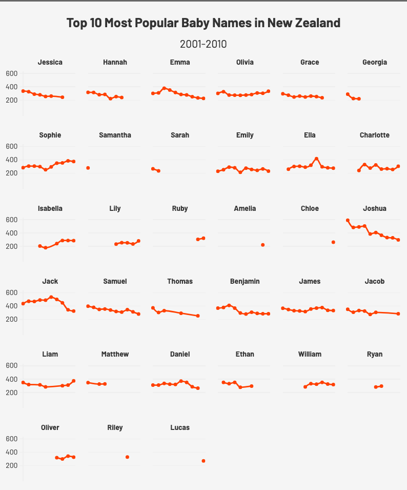
Line Graphs
In my first graph, I attempted to visualize the general trends in the most popular names in New Zealand. Each individual graph is that of a specific name, the x-axis is years, and the y-axis is the count of names. Although there are better methods to analyze trends in names in New Zealand over a specific period, I still believe that this graph has potential. This graph is very effective in showing which names briefly appeared in the top 10 (one dot) and which names were consistently in the top 10. It is also is effective in showing general trends of whether names become more or less popular. Even though I think this graph is slightly overwhelming, I still changed certain features to improve clarity. I removed the x-axis, as it just seemed to clutter the graph. I added the dates, 2001-2010 as a subtitle. I changed the coloring to make the lines specifically stand out. I had to switch the axis around.
Packed Circles Hierarchy Chart
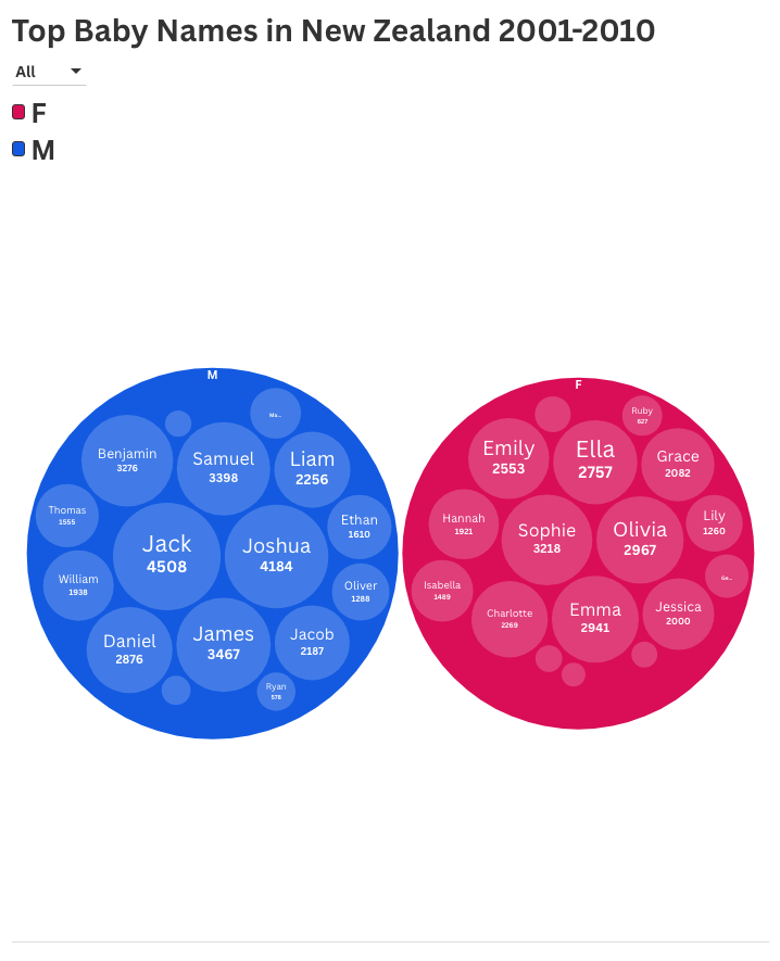
Using this hierarchy chart, I have chosen to visualize the cumulatively most popular names in New Zealand from 2001 to 2010. The names are separated into circles by gender, and within those circles, there are smaller circles with the specific names. The size of these smaller circles corresponds to the number of names. I believe this graph is appropriate because of its simplicity. It makes the “story” of the most popular names in New Zealand abundantly clear; the biggest circles, which are also centrally located, are the most popular names. The information is very accessible. As for improving clarity, the most important change I made was the colors for the circles, blue for male and pink for female. I added the counts to the bubbles to help put into perspective the bubble size, and I changed the text size hopefully be easier on the eyes.
Reflection
I found data visualization extremely rewarding. It is fascinating how much can be done with just one set of data. As discussed in the lecture, there are so many stories to find throughout the data, and by visualizing the data in a certain way, a certain story stands out. It reminds me of a prior conversation from class, that data collection and visualization is inherently argumentative. In choosing a method to show data, we are providing an argument. In my mind, data visualization for digital humanities seems like the equivalent of a thesis statement in a traditional humanities paper. By making a visualization a certain way, we are taking a stance. I think this is a great way for digital humanities students to express research conclusions in a nuanced manner. In my visualizations specifically, I could be writing an essay for a humanities class about the history of names in New Zealand. Creating a graph for this essay creates the “digital humanities” aspect, especially because the charts are interactive. In thinking about the acronym CAPS that we learned, I especially thought about contrast and simplicity throughout my process. In my circle heirarchy chart, the coloring was able to provide contrast. The circle sizes also provided a type of contrast. Furthermore, my second chart is a lot simpler than my first one, and therefore I believe it does a better job at relaying information.
Great job on your two types of data visualization! You did an excellent job showing how many different stories can emerge from the same dataset, depending on how we choose to frame them. I especially agree with your point about how visualization shapes interpretation. The process of drawing out a story from data and framing it as a form of argumentation shows a deep engagement with digital humanities concepts.
I am actually surprised at how neat both visualizations look! I understand it really will simply at a glance, which is good if you want to convey meaningful information quickly. You mentioned having issues making data cumulative, I think this is a realistic problem you have because you have to consider how the data is given to you (in the downloaded file) as well as what is available with the tools given to use, but in the end the result is good!